
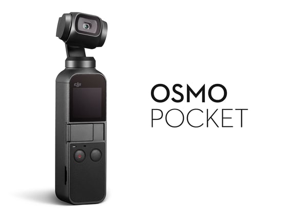
In November 2018, DJI released to the world a new product designed to revolutionize the way we take photos and achieve stable, smooth video. We introduced a highly portable 4K camera, mounted on a 3-axis gimbal, small enough to fit easily in your pocket. This mini, mighty device, Osmo Pocket was conceived from the idea that everyone can capture stunning footage from all of life’s adventures.
For a glimpse into how our design team breathed life into this product, we sat down with in-house designers Jeremy Kim, Aaron Wang, and Ben He in the company’s Shenzhen office.
Origins
Osmo Pocket stemmed from the concept of bringing DJI’s renowned aerial gimbals from the sky into your hands. This began with the very first Osmo, which was the Zenmuse X3 gimbal camera of the Inspire 1, mounted onto a handheld grip. The evolution of DJI drones favored compact size, intelligent features, and unique capabilities, with the Mavic Pro giving the Osmo team their next goal for handheld stabilizers.
Aaron, who led the initial part of the design process, said that designing a product like Osmo Pocket brought on challenges and lengthy discussions about potential features, form factor, and technology, to name a few.
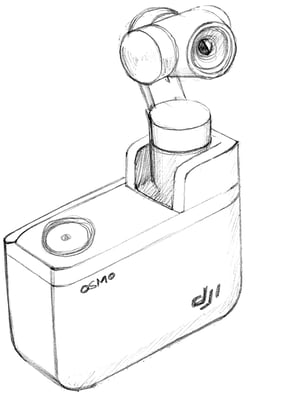
“In 2016, we first came up with a box-shaped camera, maybe half the size of a brick. It had a back screen with a camera and gimbal combo that could be unfolded from the top for use.”
However, this prototype came with concerns, mainly due to wear and tear, size, and overall usability. Bulky and unwieldy, the next concepts focused on a minimal, yet sophisticated build.
Transformations
Today’s Osmo Pocket is the perfect example of ho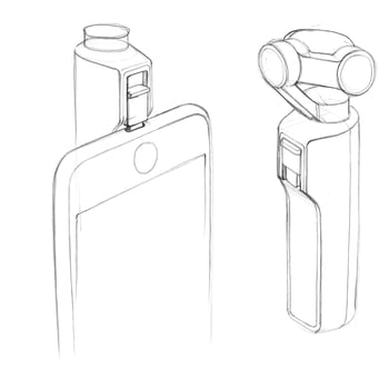 w form follows function. Portable, unique, and intuitively designed, this capable camera was the ideal blend of technology and design.
“Initially, there were so many ideas for functions and features that I almost felt like Osmo Pocket was turning into a supercomputer,” Aaron admitted under a laugh.
After struggling with the challenges from the first prototype, the designers were able to quickly draft up the next design without hesitation, as all directions pointed to a minimal form that could easily fit in one hand.
 “The second concept is nearly the same as our final Osmo Pocket, except it had a smartphone connection port where the screen is currently located, allowing vertical video shooting,” shared Jeremy Kim, head of DJI’s industrial design team. “Another difference is that there were no buttons or a screen to allow standalone use.” From there, the team started to consider user experience. As designers at DJI, they knew that their mission here was to make complex technology easy, simple, intuitive, and accessible to everyone.
“We knew that it was necessary for us to make Osmo Pocket usable without a smartphone, but still offer the option to connect their mobile device for expanded use. We added two multi-purpose buttons but still wanted to keep it minimal, so we added a touchscreen to offer a variety of features.”

In 2017, the team found a way to make Osmo Pocket simple enough to understand, as well as equip it with a variety of advanced features for those who wanted more.
Every Detail Matters
Ben, who took the lead on the final design stages, said the size of Osmo Pocket was inspired by lipstick and Tesla’s 18650 battery, which is 18mm in diameter and 65mm in length.
“Obviously, this product needed to fit into every pocket – your jeans, shirt, dress, anything – which is a pretty extreme goal. Being able to fit in your pocket means more than just its size. It also means you don’t need anything else like a bag to carry it separately, letting you bring it to anywhere, any time.”

Fitting every component into a tiny form factor without compromising on performance was a tough task, and no detail was spared. Wires needed to be thinner, so they were redesigned to be even thinner. To prevent overheating, different materials were incorporated.
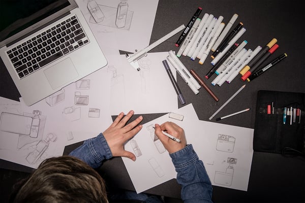
The biggest consideration turned out to be the connection port. Initially, this port was built-in and jutted out from the left side of the product; this forced the consideration of two different Osmo Pocket versions for Apple and Android devices.
“That’s when we came up with the solution of a swappable connector for different smartphone models,” shared Jeremy. “We then spent the next few weeks deciding on the size of the connector. The larger it became, the lower the power and recording buttons had to be placed, making single-handed use more difficult.”
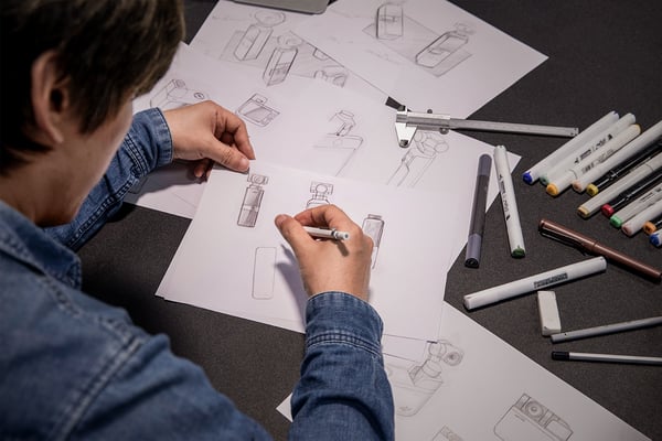
After more consideration, trial, and error, Jeremy and his team finalized the universal port and smartphone adapters we have today, a design aspect of which Jeremy is proudest.
Possibility
Osmo Pocket’s early designs in 2015 faced an essential challenge: having no other product to compare it to. Surprisingly, this put no pressure on the task. As Jeremy puts it, “We’re not talking about smartphones or computers that people already know well and familiar with, so it is always challenging. But we were more confident with Osmo Pocket.
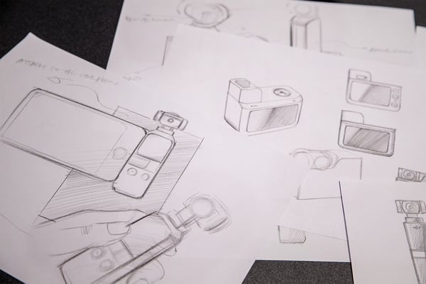
“Since releasing the first Osmo, we’ve been studying market trends like vlogging and analyzed how customers used these products. Based on this information, we were believed in Osmo Pocket’s ability to change the perception of cameras for recording daily life.”

In fact, the team’s biggest focus was always about making a product that would fit in all our daily essentials. They wanted their camera to become like the phone, wallet, and keys – items that you couldn’t leave home without.
Impact
After its release in November, Osmo Pocket has made its presence known. People are embracing this handheld camera, and more third-party accessories are coming out, taking advantage of what this compact device has to offer.
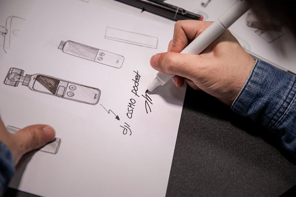
“It’s always fun to watch how people play around with our products, and it inspires us,” remarked Aaron. “User feedback guides our next project, so much that it’s the first step, because we can then think creatively from different angles in order to solve new challenges. These ideas can become the concepts of new products, so we look forward to everyone’s Osmo Pocket story.”

![]() P.S. – We want to hear from you! Please let us know what you would like to read from us by clicking here. We look forward to your comments.
P.S. – We want to hear from you! Please let us know what you would like to read from us by clicking here. We look forward to your comments.
